
Cookie Banner Examples in 2026: 7 Patterns Worth Copying and 6 Mistakes to Avoid
Anyone evaluating cookie banner examples in 2026 is really balancing operational risk, marketing ambition, and buyer trust at the same time. A policy page alone does not solve that problem; the workflow behind the site does.
The decision around cookie banner examples usually turns on trust, conversion, and operational risk at the same time. The teams that get it right are the ones that test the live journey instead of relying on policy language alone.
That is the standard that matters now.
The current regulator guidance is not subtle. The ICO’s live cookies guidance still says your information must be “clear and comprehensive,” that you “cannot set non-essential cookies” before consent, and that users should have a way to enable or disable non-essential cookies and you should “make this easy to do.” In the UK, the ICO also said on April 29, 2026 that “99% of the UK’s top 1,000 websites now meet compliance standards for cookie banners” after focused compliance work. In France, the CNIL continues to say rejecting cookies should be “just as easy as accepting them.” And Google still says Consent Mode defaults need to be set “before any commands that send measurement data.”
That means strong cookie banner examples in late 2026 are not mostly about color palettes.
They are about:
- first-layer choice;
- honest wording;
- real pre-consent behavior;
- mobile readability;
- settings that can be reopened and changed;
- policy text and proof that match the runtime.
If you want nearby companion reads first, start with these guides to EU cookie banner, cookie message, and Cookie Control. This page stays more visual and practical. It is the cookie banner examples review I would use before copying a layout into production.
If your team is trying to get cookie banner examples under control without adding a heavyweight privacy stack, DataShyre can help. DataShyre focuses on consent and preference management that are easier to implement, easier to operate, and easier to trust on a live site. Start with DataShyre’s consent and preference management or book a demo.
If your team is comparing OneTrust, Cookiebot, CookieYes, Complianz, or a homegrown banner, DataShyre can help connect the banner pattern to your actual scripts, GTM ordering, policy text, and consent records. That is where most banner projects quietly fail.
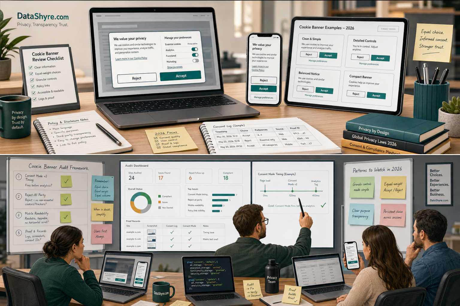
1. Example: first-layer accept and reject buttons with equal weight
This is the first pattern worth copying.
If your first layer offers Accept all, it should also offer a genuinely visible Reject all or equivalent first-layer refusal path.
That does not mean a faint text link buried in a paragraph. It means a real control that a normal visitor can spot and use quickly.
Why it matters:
- the CNIL says rejecting cookies should be “just as easy as accepting them”;
- the EDPB cookie-banner taskforce flagged designs where the refusal option sits outside the banner or is visually drowned out;
- the ICO’s current position still expects real user control over non-essential cookies.
If I were borrowing from strong cookie banner examples, this is the first thing I would copy:
- two first-layer buttons with similar visual weight;
- plain labels like
Accept allandReject all; - a third route for
Manage preferenceswhen category choices matter.
2. Example: short banner copy that explains purpose without legal fog
A good example does not try to cram the entire privacy policy into the banner.
It does enough to let the visitor understand the choice.
The ICO still says cookie information must be “clear and comprehensive.” That pushes good cookie banner examples toward a simple first layer:
- what the optional technologies are for;
- whether they support analytics, ads, personalization, embeds, or another stated purpose;
- where the visitor can get fuller detail.
The better pattern is:
- a short first-layer explanation in plain language;
- a visible link to the fuller cookie or privacy page;
- category detail on the second layer;
- vendor and purpose detail that matches the real stack.
The weaker pattern is a banner that says we value your privacy and then tells the user almost nothing useful.
3. Example: category choices that map to the actual scripts on the page
This is where nice-looking cookie banner examples often break down.
The labels look fine, but the categories do not line up with what actually fires.
If your banner offers categories such as analytics, advertising, and functional cookies, those categories need to control the real technologies behind them. Otherwise the example is decoration, not compliance design.
This is also why copying another site’s button layout is never enough. Your own stack may include:
- Google tags;
- Meta or LinkedIn pixels;
- chat widgets;
- booking tools;
- video embeds;
- A/B testing scripts;
- affiliate or partner trackers.
Strong cookie banner examples are honest about categories because the categories map to the runtime.
Weak ones offer tidy labels while GTM still drops whatever it wants underneath.
4. Example: Consent Mode and tag timing that work before the page starts measuring
This is one of the most useful patterns to copy in 2026.
Google’s current guidance says you should call the default consent command on every page “before any commands that send measurement data.” It also says that if your banner loads asynchronously, you may need wait_for_update so tags do not get ahead of the user’s choice.
So one of the best cookie banner examples is not something the visitor even sees.
It is the implementation pattern behind the visible banner:
- consent defaults set early;
- correct region handling where needed;
- updates fired on the page where the visitor interacts;
- tag behavior that changes immediately when consent changes;
- testing that confirms the page does not leak non-essential behavior before the banner resolves it.
If your banner looks perfect but your tag order is wrong, the example is still broken.
If you want the short rule: treat banner design and tag timing as one system.
5. Example: mobile banners that keep the refusal path obvious
Desktop mockups hide a lot of bad decisions.
Mobile surfaces them.
The ICO’s guidance on valid consent and the EDPB’s concern about misleading layouts both matter more on small screens, where a buried refusal path becomes even easier to miss.
Good cookie banner examples on mobile usually have:
- enough contrast to keep both choices readable;
- enough spacing so the refusal path does not blend into policy text;
- buttons that fit the viewport without truncating the labels;
- a preference path that is usable without precision tapping;
- no giant wall of text pushing the action controls below the fold.
This is one of the easiest live checks to run.
Open the banner on a real phone and ask one boring question:
can a normal person reject optional tracking in two taps without hunting for it
If the answer is no, the example is not worth copying.
6. Example: a reopenable settings path and easy withdrawal
A banner is not only a first-visit moment.
It also needs a clean after-the-fact control path.
The ICO says users should have the means to enable or disable non-essential cookies and that you should “make this easy to do.” That means strong cookie banner examples include:
- a persistent footer or account-area settings link;
- a privacy or cookie page that points back to settings;
- category controls that can move from granted to denied, not only the other way around;
- a live implementation that actually stops or changes the relevant tags after the user withdraws.
This is another place where banner galleries lie by omission.
The screenshot may show a beautiful first layer while saying nothing about what happens later. In real deployments, the later control path matters just as much.
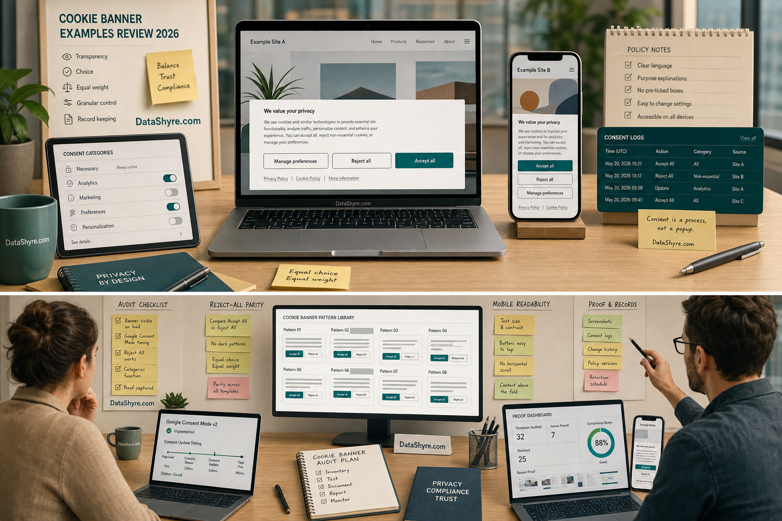
7. Example: banner, policy, and consent records that tell the same story
The strongest cookie banner examples do not end at the banner.
They line up with:
- the cookie page;
- the privacy notice;
- the consent log or preference record;
- the real technologies loaded on the site.
That matters because the current enforcement pattern is not about banners in isolation. It is about whether the visible choice, the data collection behavior, and the disclosures match.
If a site says analytics only with consent but the runtime fires ad-tech vendors before any choice, the example fails.
If a site says manage your preferences anytime but there is no usable return path, the example fails.
If a site says functional cookies only but the page loads five marketing tags, the example fails.
The banner, the policy, and the logs need to describe the same system.
6 mistakes to avoid when you borrow cookie banner examples
Most poor implementations come from copying the visible design without copying the underlying controls.
Here are the six mistakes I would watch for first:
- hiding the reject path in a text link while styling accept as the only real button;
- loading non-essential tags before the user’s choice is processed;
- using vague language like
improve your experienceinstead of naming purposes clearly; - treating the mobile banner like a compressed desktop mockup;
- forgetting the reopen and withdrawal path after first visit;
- letting the cookie page, GTM logic, and consent records drift apart.
Those mistakes are exactly why so many public cookie banner examples look acceptable in screenshots but fail in a live audit.
The practical answer
If you want the shortest honest answer on cookie banner examples in 2026, it is this:
Copy patterns, not cosmetics.
Copy:
- equal-weight accept and reject controls;
- short and specific purpose language;
- categories tied to the real stack;
- Consent Mode timing that runs before measurement;
- mobile clarity;
- reopenable settings;
- proof that matches the live site.
Everything else is just decoration around those controls.
FAQ
Do good cookie banner examples always need a reject-all button on the first layer?
If you surface an Accept all action, the safest practical pattern is a clearly visible first-layer refusal path with comparable prominence. That is the direction of current enforcement and dark-pattern scrutiny.
Are gallery screenshots enough to choose a consent banner?
No. Useful cookie banner examples need live testing for script timing, mobile behavior, second-layer settings, and withdrawal.
Can a vendor template solve this by itself?
For most teams, cookie banner examples becomes easier to manage once it is treated as an operating decision instead of a one-time banner task.
Sources
- ICO, Cookies and similar technologies: https://ico.org.uk/for-organisations/direct-marketing-and-privacy-and-electronic-communications/guide-to-pecr/cookies-and-similar-technologies/
- ICO, Final storage and access technologies guidance published (April 29, 2026): https://ico.org.uk/about-the-ico/media-centre/news-and-blogs/2026/04/final-storage-and-access-technologies-guidance-published/
- CNIL, Dark Patterns in Cookie Banners: https://www.cnil.fr/en/dark-patterns-cookie-banners-cnil-issues-formal-notice-website-publishers
- Google for Developers, Set up consent mode on websites: https://developers.google.com/tag-platform/security/guides/consent
- EDPB, Report of the work undertaken by the Cookie Banner Taskforce: https://www.edpb.europa.eu/system/files/documents/2023-01/edpb_20230118_report_cookie_banner_taskforce_en.pdf